App Store screenshots using interface close-ups
104 listings that use interface close-ups, from stitch., Lumino City and Mekorama. Most are shopping, education and business apps.





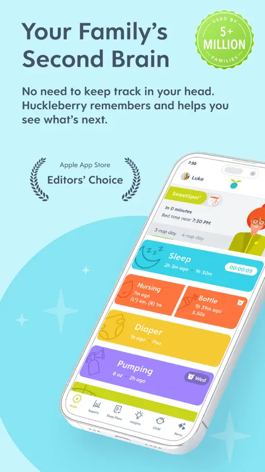
A pale blue sequence combines angled devices, small illustrations and enlarged tracking details, with distinct spacing around each feature.


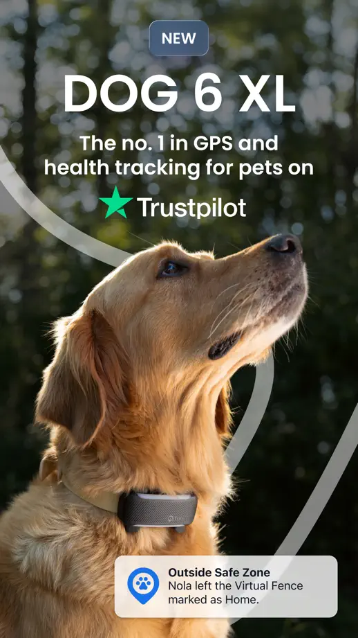
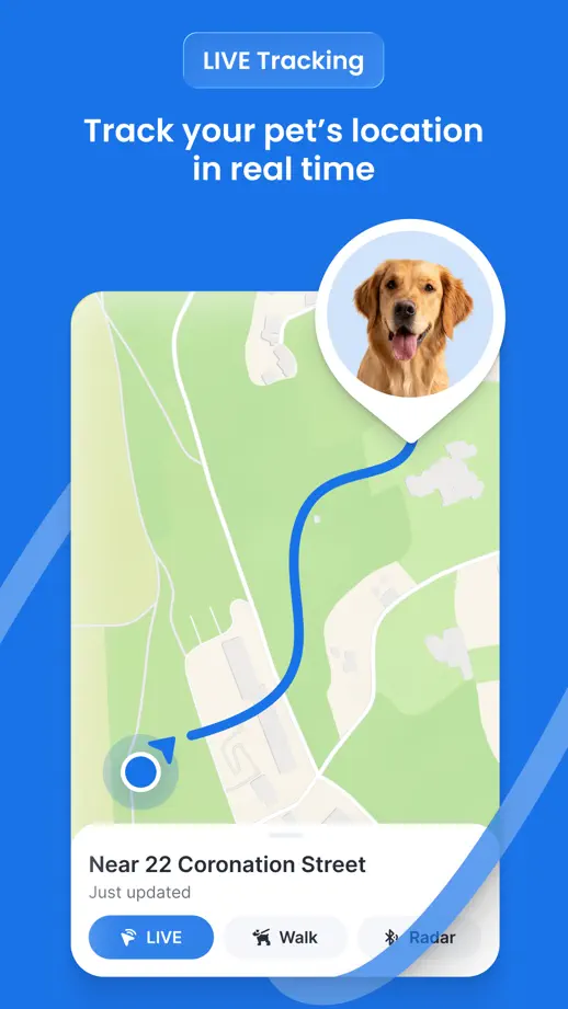
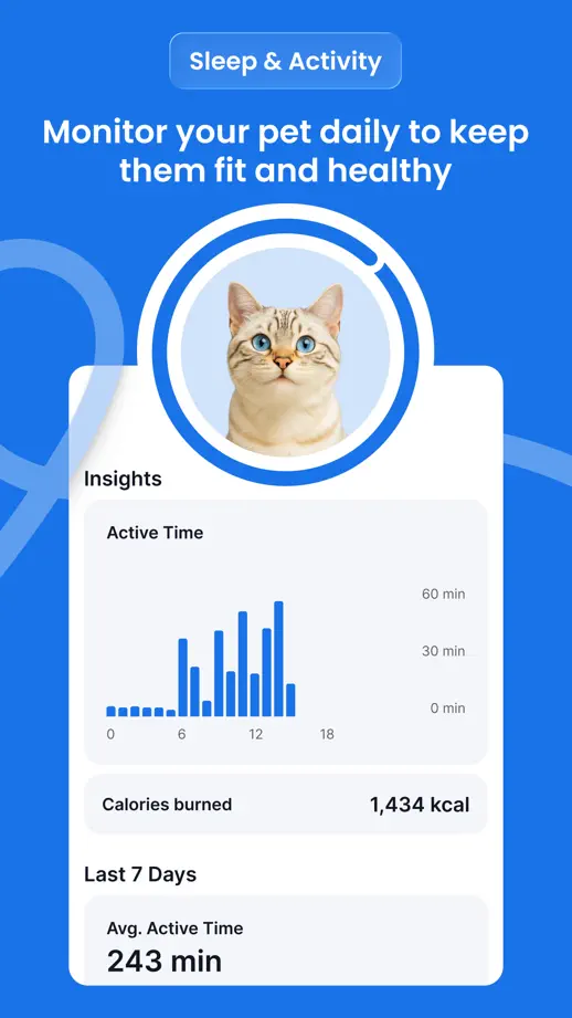
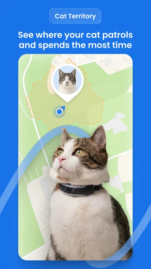
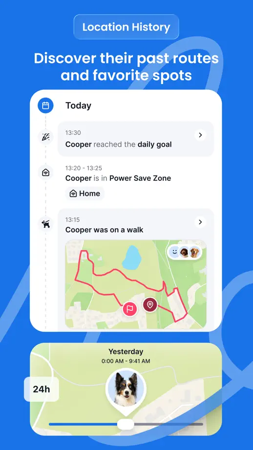
Pet portraits, maps and floating tracking cards share a blue backdrop, with a fine line weaving through the panels.




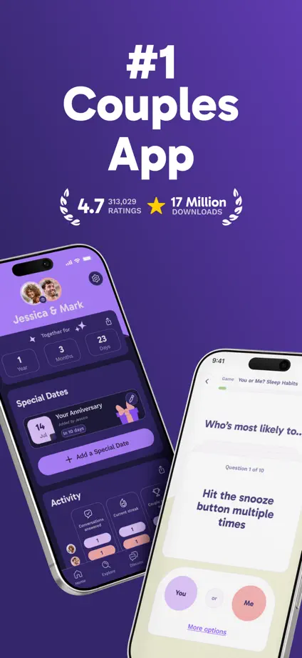
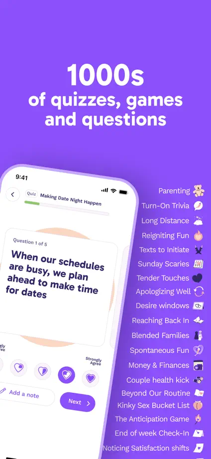
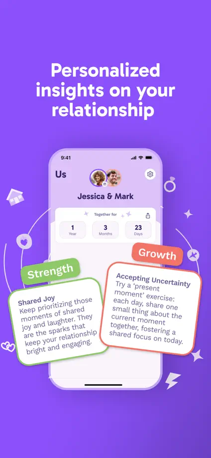
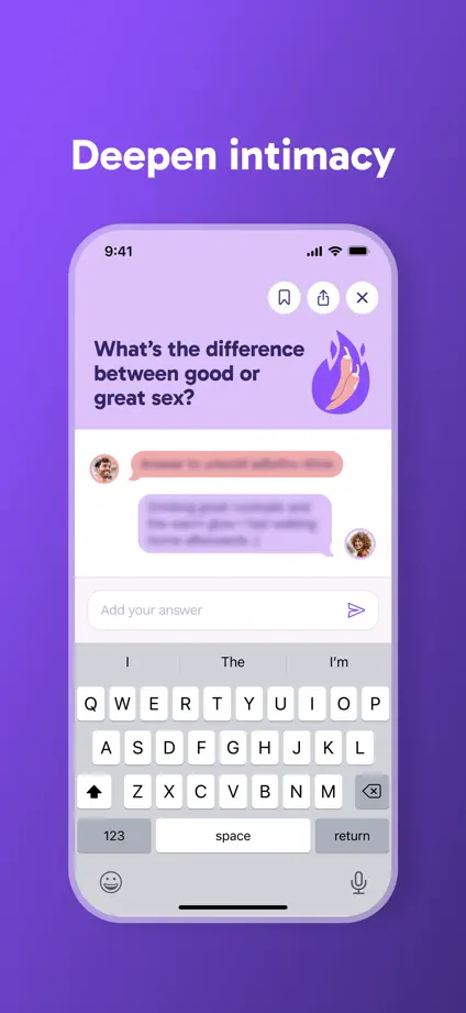
Purple gradients connect tilted devices, illustrated cards and enlarged questions, with generous space above each feature.





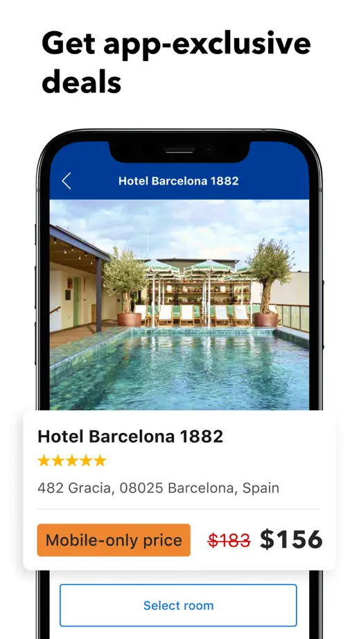
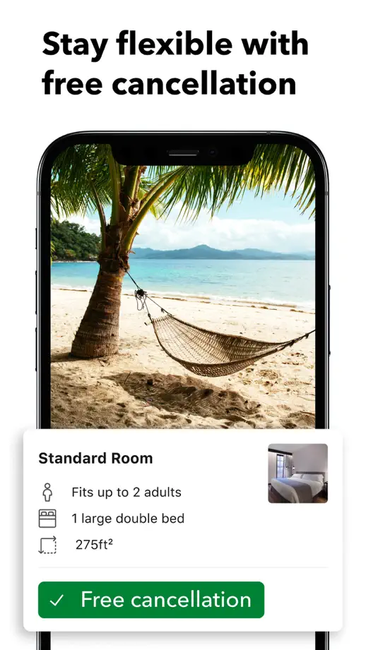
Large white interface cards overlap devices and travel photography, highlighting one booking interaction per panel.


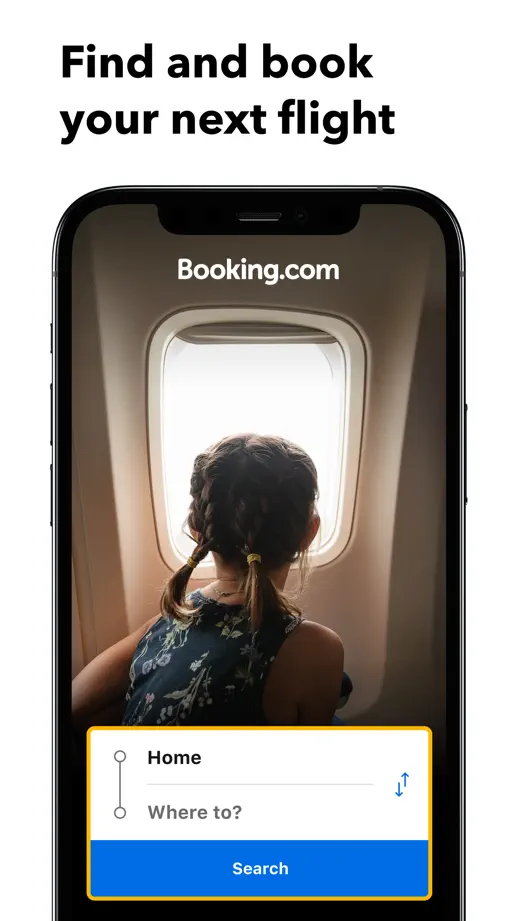

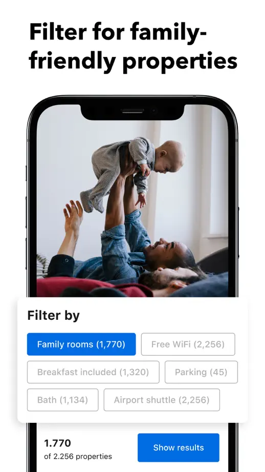


Navy serif headings and cream space soften a repeated device layout, while enlarged white cards highlight selected controls.
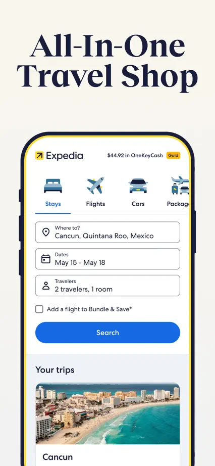
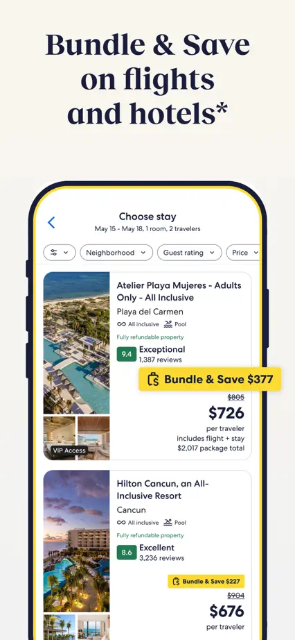
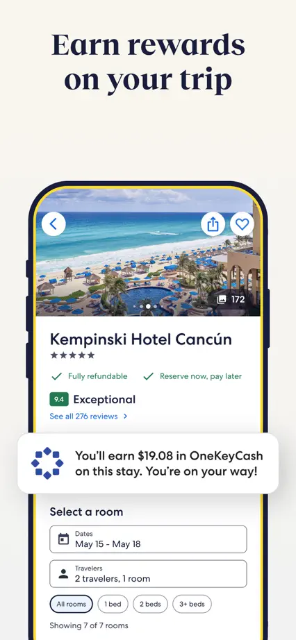
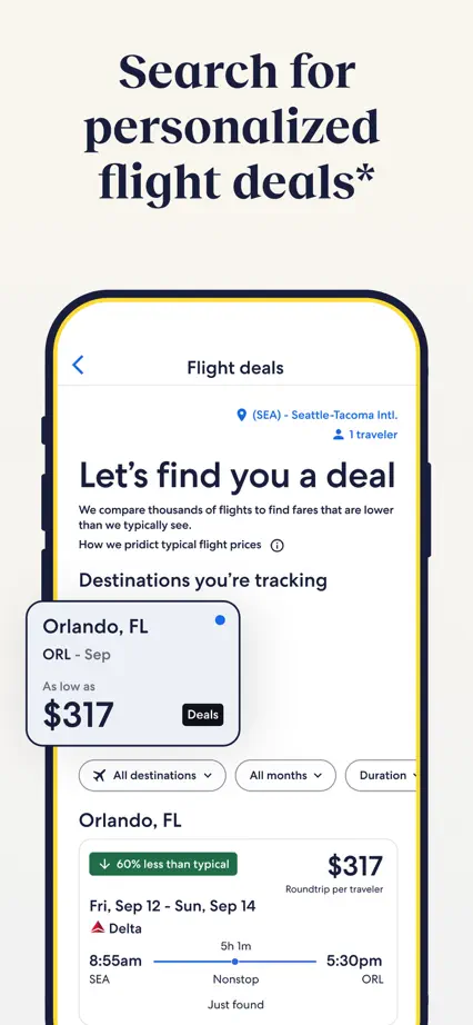
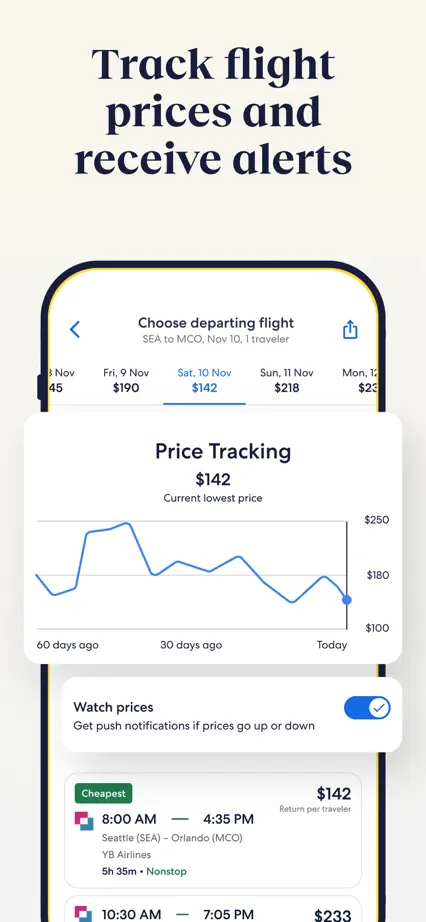

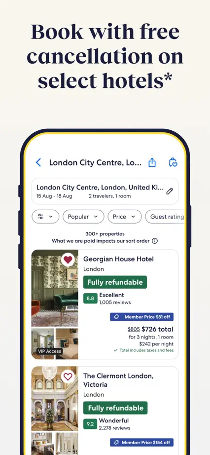


A single blue backdrop and compact left-aligned headings support floating interface fragments without visible device frames.


Small orange icons and bold headings anchor a simple white sequence, with selected interface cards pulled out of devices.
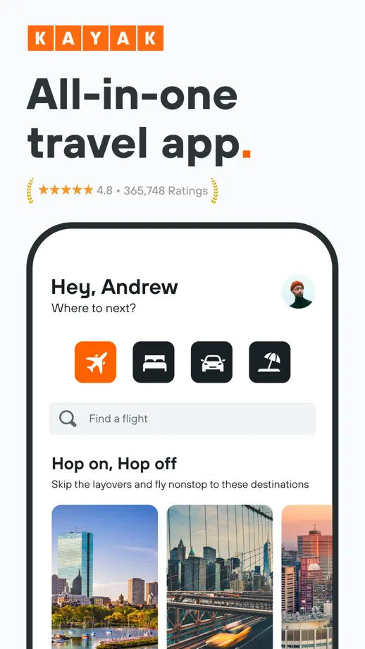

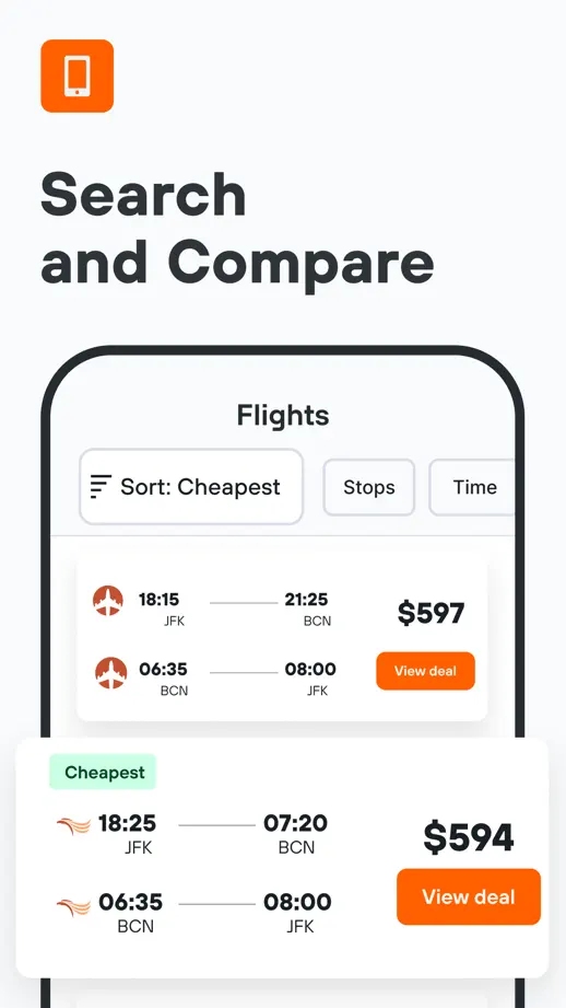

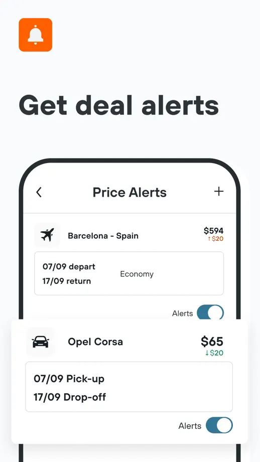


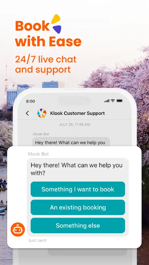
Orange headings stand over pale destination photographs, while floating cards bring booking and support details forward.


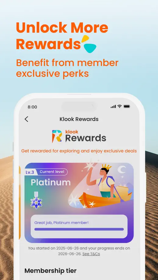

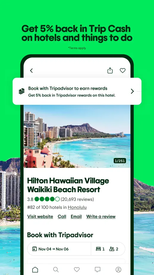
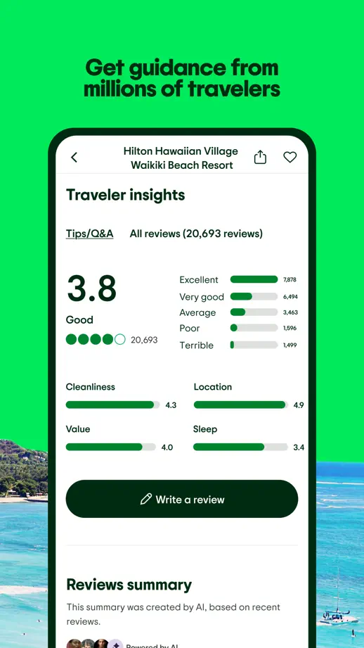
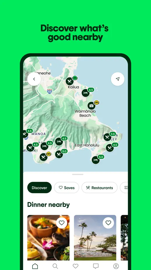
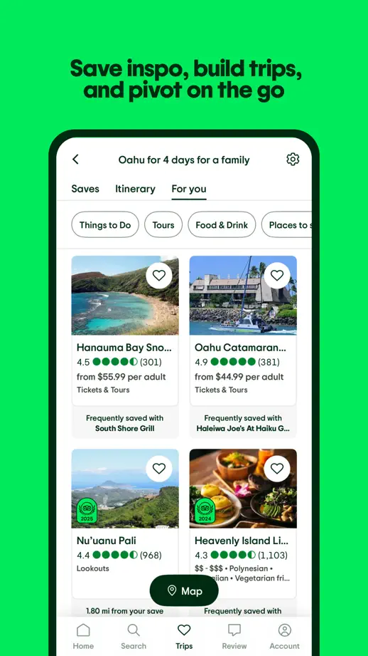
Bright green panels and a large opening headline frame travel photography, oversized rating details and map screens.


Condensed white headlines, orange accents and music photography give the sequence a strong poster-like character.


Atmospheric music photography alternates with angled landscape devices and close-ups of the dark mixing interface.

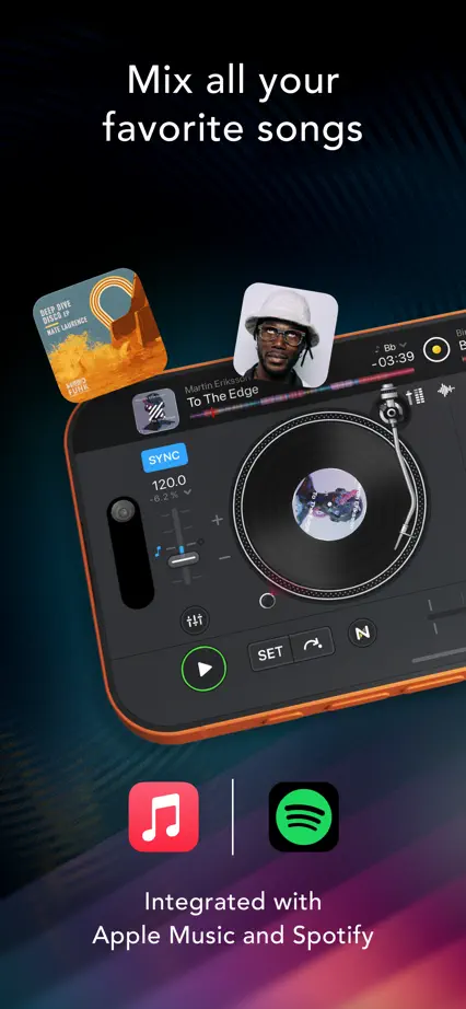

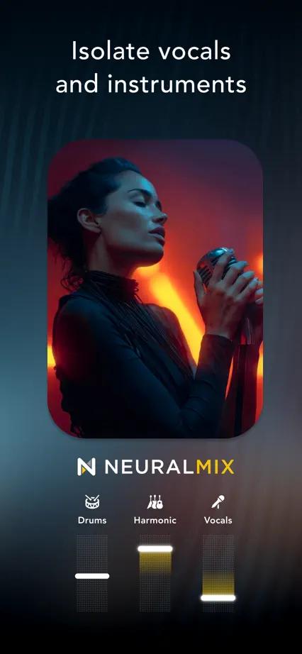
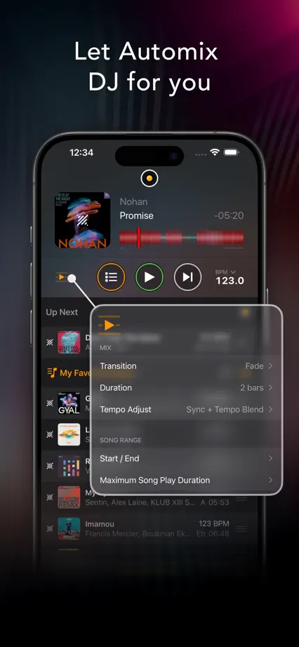


Each panel uses a different solid color, with horizontal interface crops, floating music cards and bold compact headings.


