App Store screenshots using interface close-ups
104 listings that use interface close-ups, from stitch., Lumino City and Mekorama. Most are shopping, education and business apps.





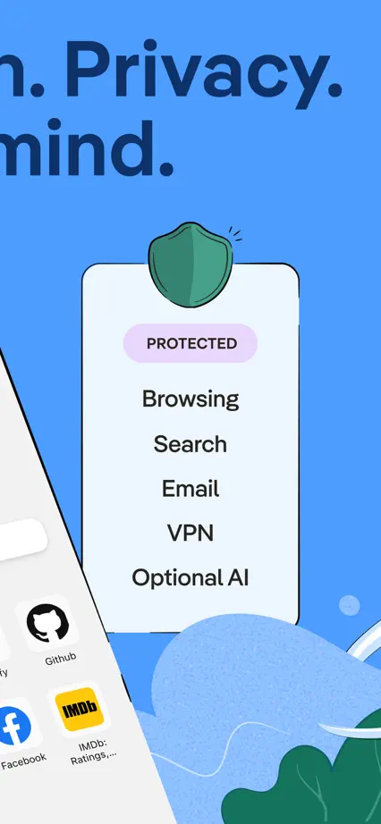
An oversized opening headline leads into blue and white panels combining interface cards with simple privacy illustrations.







Serif headings and generous pale space let browser cards, sheets and selected interface details carry the sequence.


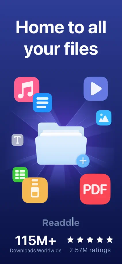
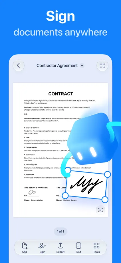
Dimensional file artwork opens a dark blue sequence, followed by large document interfaces and enlarged editing controls.


Blue highlights within short headings give a steady rhythm to large white devices and floating interface details.


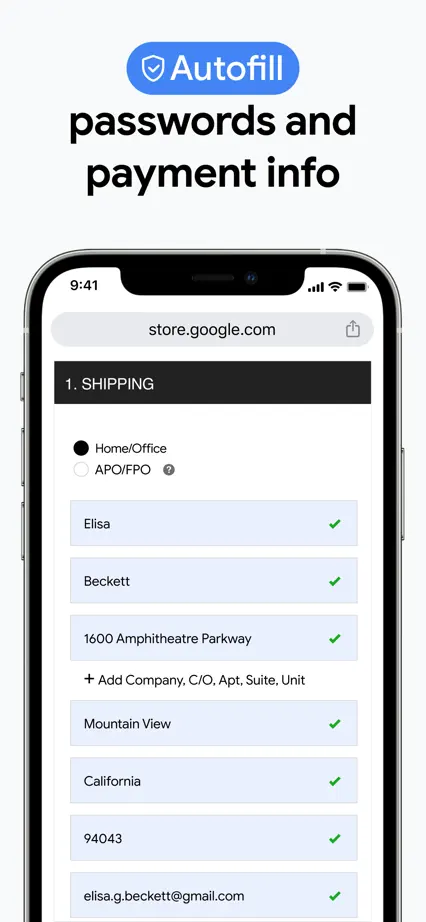
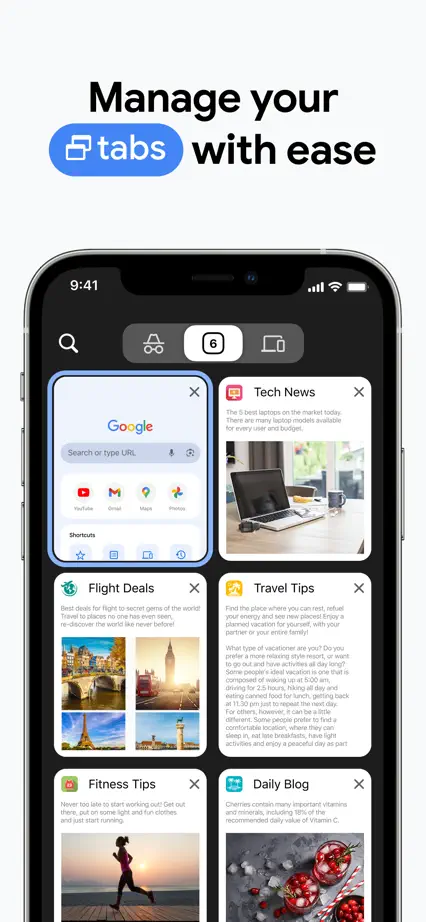
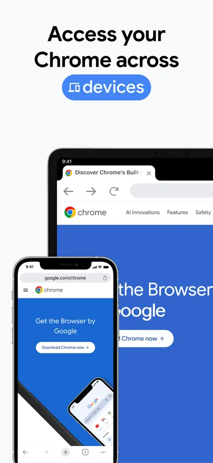
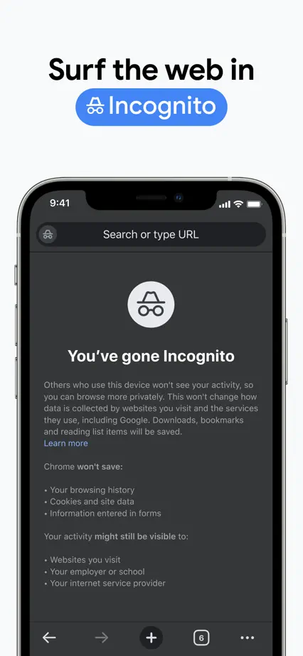

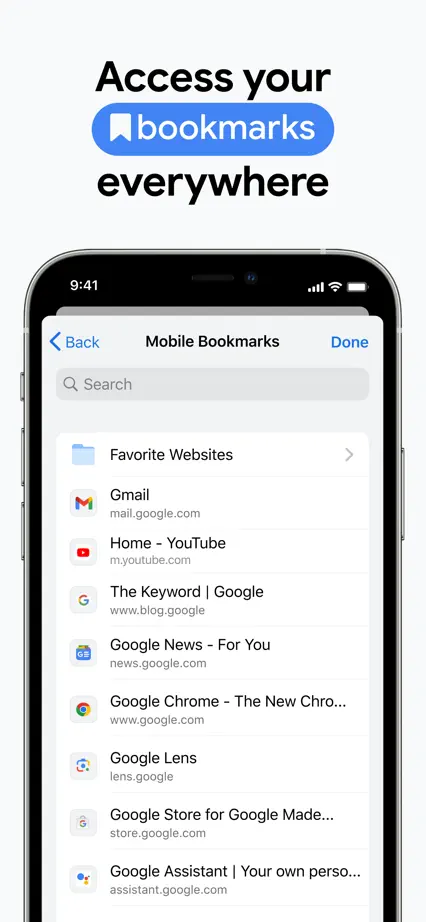

Bright blue panels and a small dimensional mascot connect large document interfaces, with consistent feature headings.
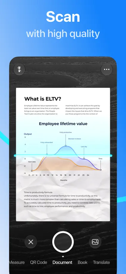



A repeated red-to-pink backdrop and condensed headings frame dark interface crops and a closing content collage.


Yellow highlights connect headings, selected interface controls and the closing brand panel on a dark background.


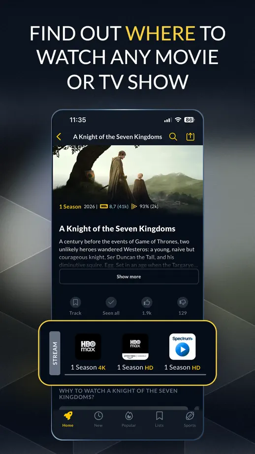


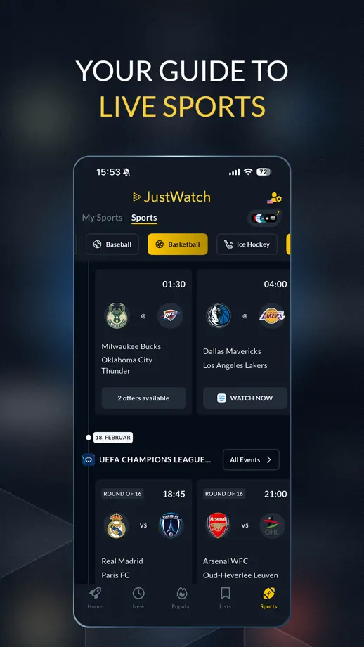


Warm yellow panels pair literary serif headings with reader illustrations, book photography and large interface crops.


Four blue panels maintain a consistent headline and device position, with selected controls pulled forward for emphasis.


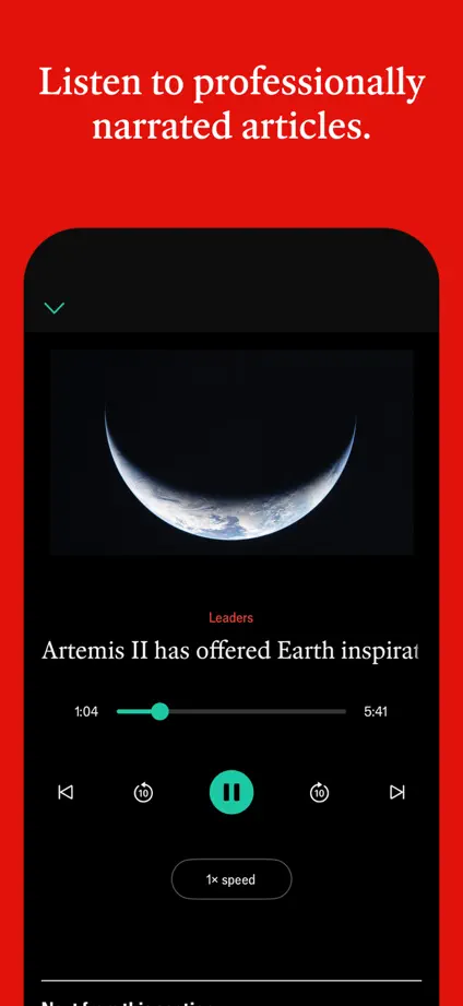
A continuous red background and small serif headings frame large black interface crops, with content and audio screens providing variation.




A coordinated seasonal photo palette connects collages, search details and shopping interfaces across the entire sequence.


Cream and green panels mix pet photography, maps and simple cards, keeping the same horizontal color split throughout.


