App Store screenshots using color progression
50 listings that use color progression, from Alto's Adventure, Alto's Odyssey and Florence. Most are games, education and music apps.





Large devices sit tightly below compact headings, alternating pale and dark panels to show both interface themes.

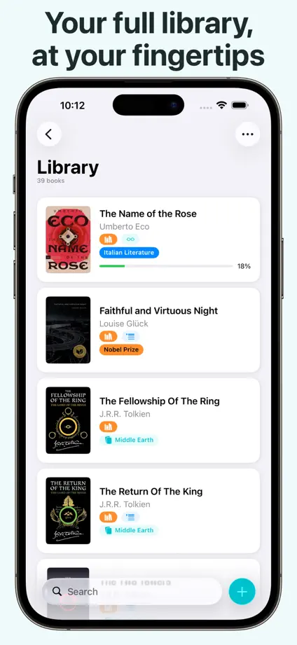


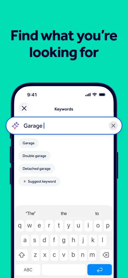
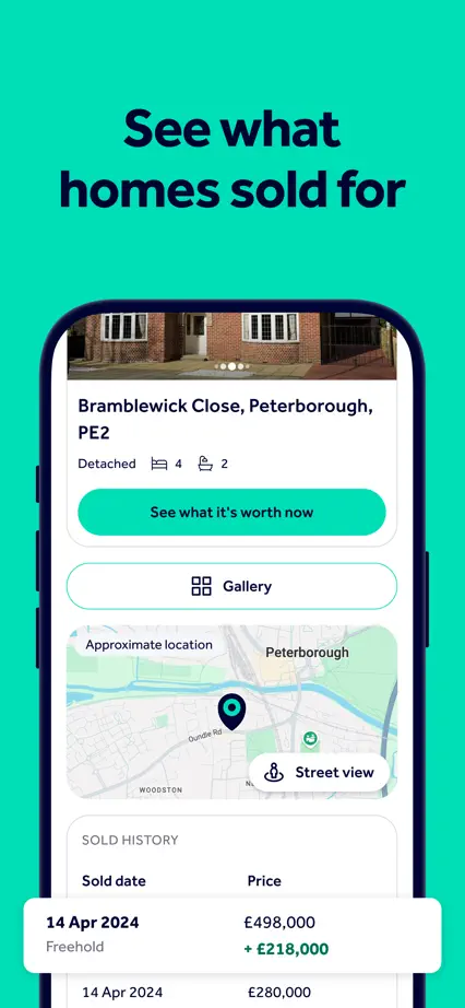
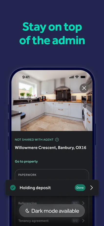
An angled device spans the opening pair, followed by consistent turquoise panels and a darker closing section.







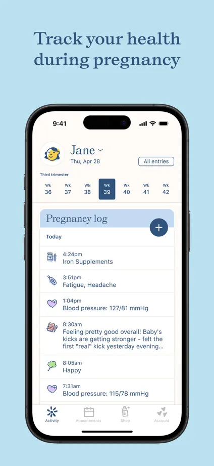
Soft pastel backgrounds and small serif headings frame a consistent device sequence, beginning with an angled overlapping pair.



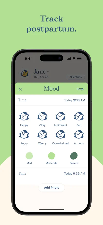
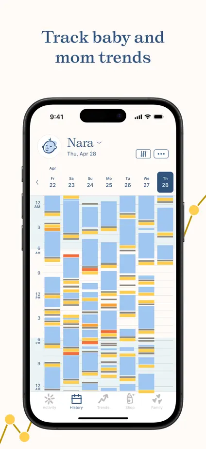

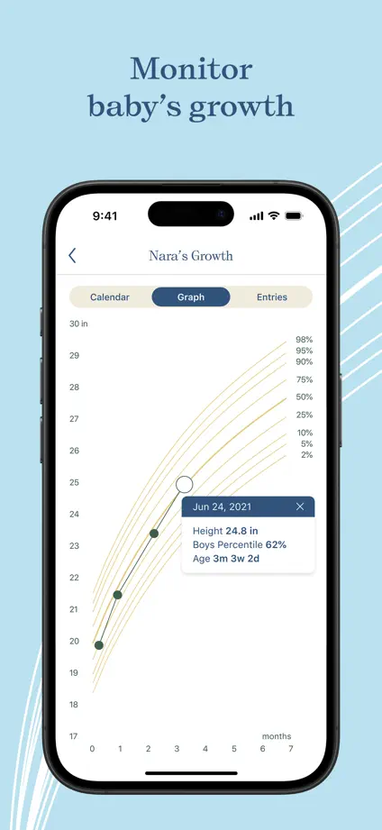
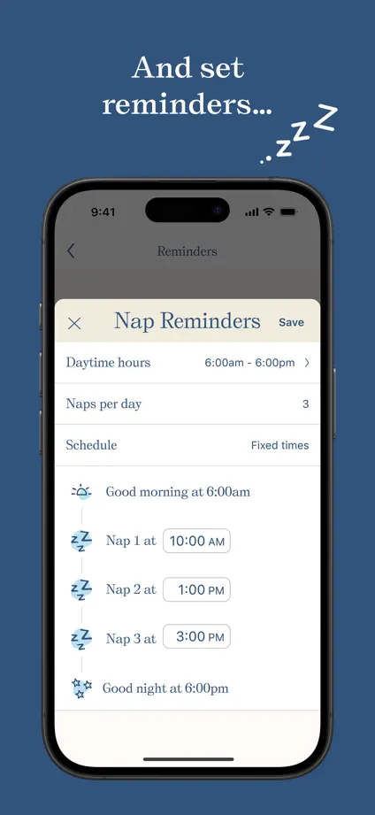

Oversized opening type and travel photography lead into alternating orange and dark brown panels with large devices.


Brightly colored panels change with each feature while a repeated heading and device layout keeps the sequence consistent.


Each panel uses a different solid color, with horizontal interface crops, floating music cards and bold compact headings.


Musician portraits and dark interface crops alternate with pale blue panels, varying both caption placement and device scale.

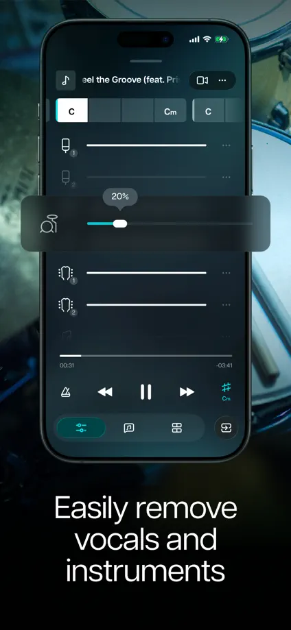
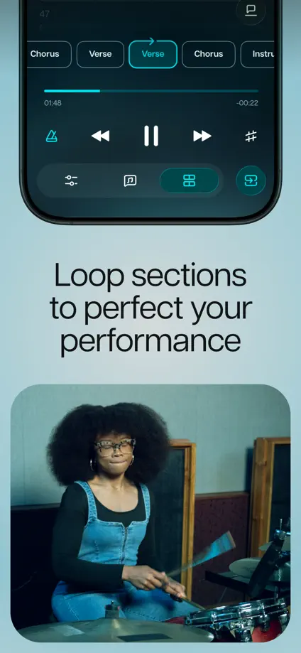
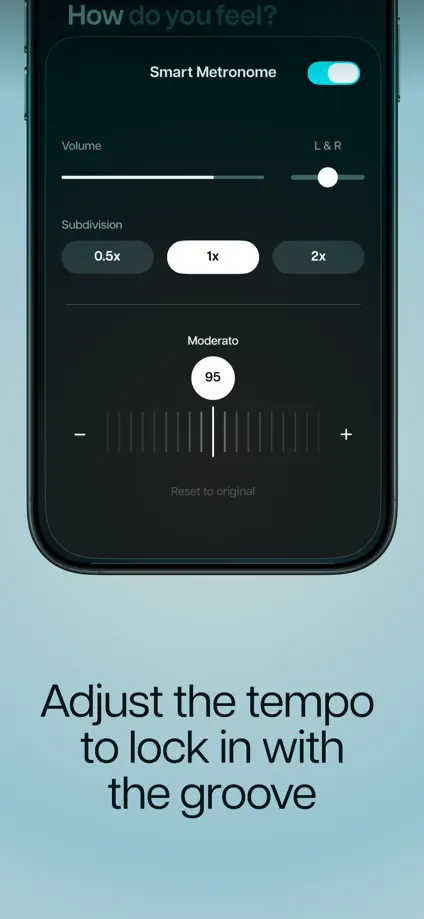
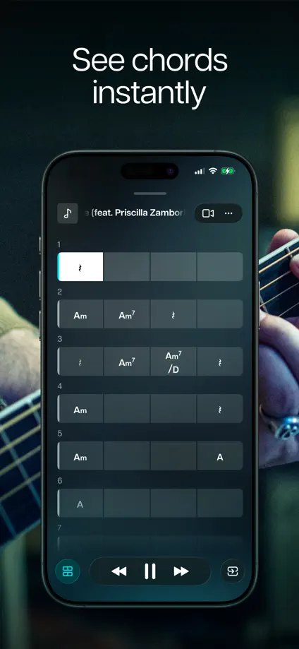
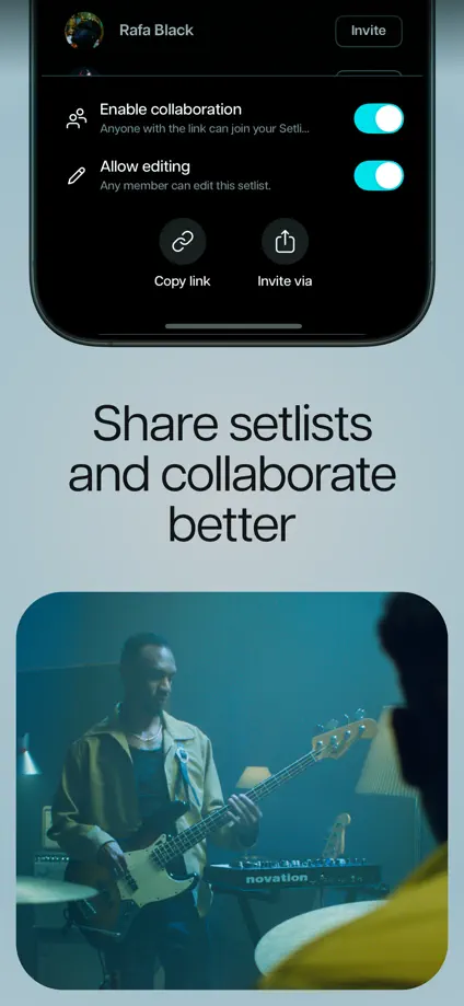
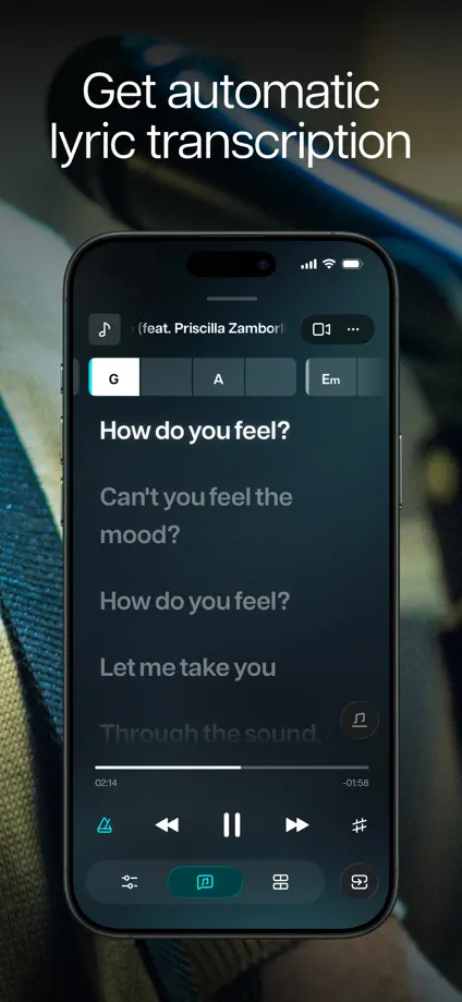
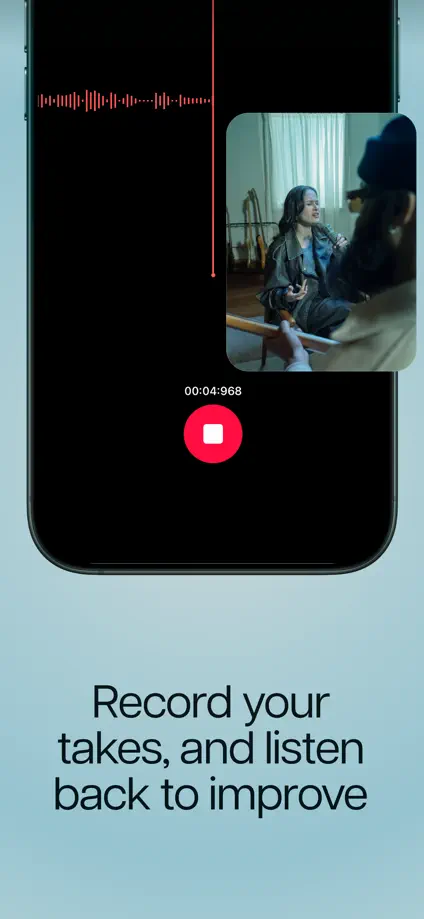


Small centered headings and pastel color changes frame a consistent sequence of dark music-making screens.

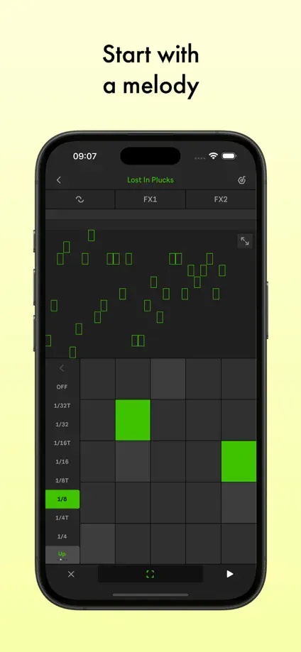
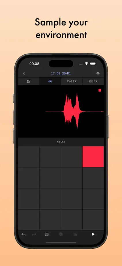
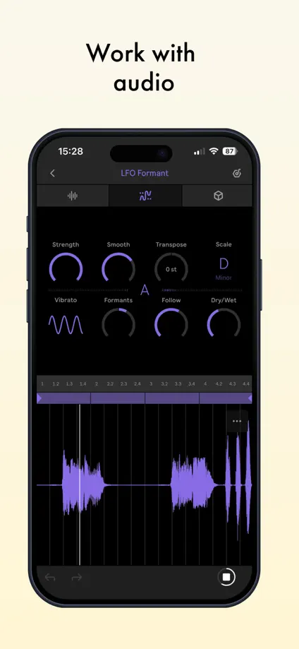


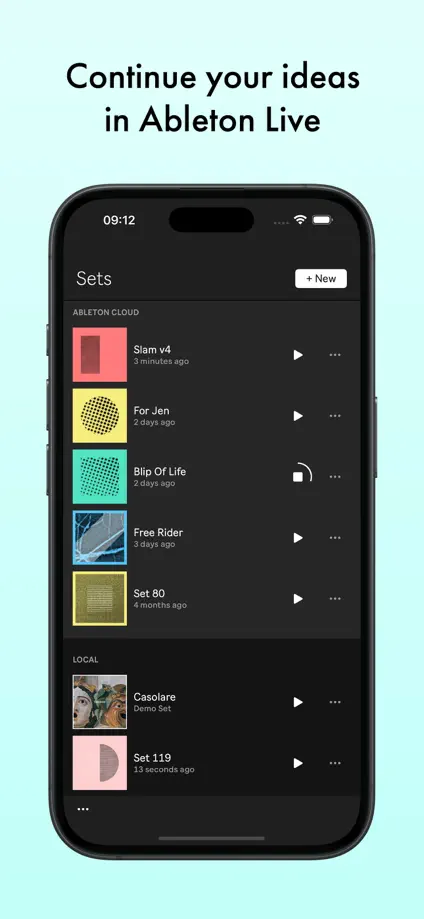

Pastel gradients and large editing screens keep finished artwork prominent, with selected controls and objects crossing the device edge.


Colorful panels pair illustrated artwork with oversized drawing tools and interface details, giving each technique its own palette.


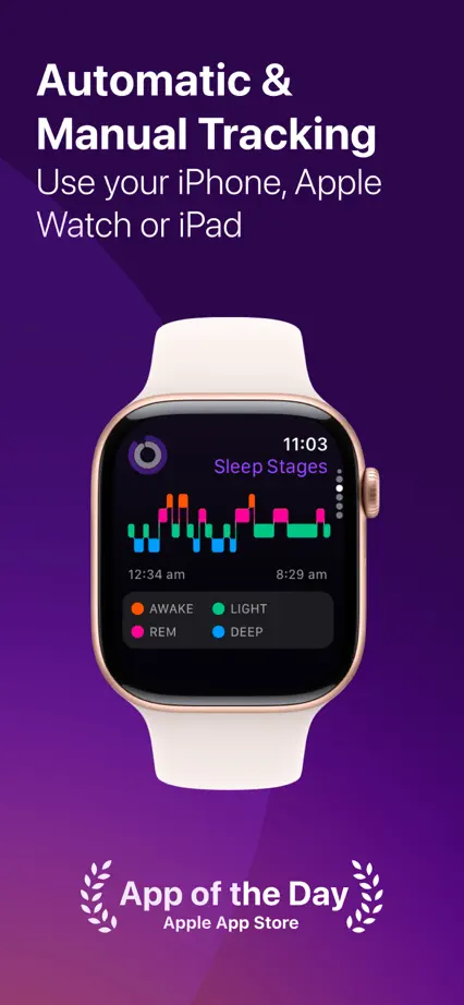
An angled phone spans the opening pair, leading into purple panels that alternate watches, charts and large phone interfaces.




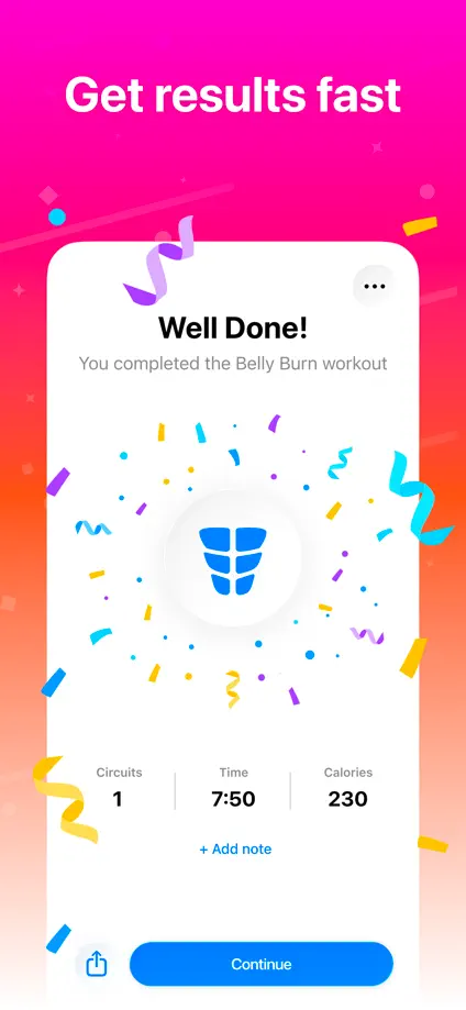
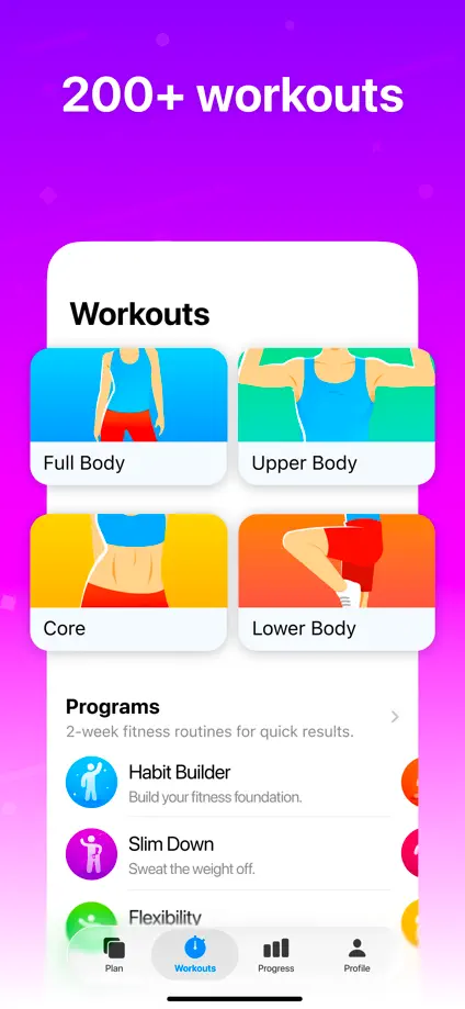
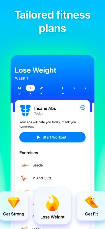
Saturated color changes, illustrated exercise figures and floating interface panels give each feature a distinct composition.