Teardown · No. 03 · 30 Sept 2026
Lights off
Dark listings that work, and the light source each of them uses.
A dark background makes screens glow, and it stands out in a store that is mostly white. It also makes every frame look the same unless something lights it. Each of these three picks one light source and one labeling device, and sticks to both.
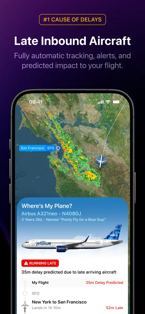
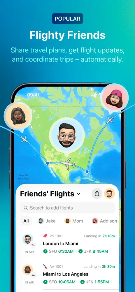
Flighty: a night flight, with badges
Flighty’s first frame is a rendered plane over a wireframe landscape on deep purple, with the Apple Design Award and App of the Year finalist credits at the bottom. The second frame is a press quote over a tilted phone and a lit-up Earth.
From there, small uppercase badges do the labeling: “#1 CAUSE OF DELAYS”, “#2 CAUSE OF DELAYS”, “POPULAR”, “FASTER THAN AIRLINES”, “LIVE”. Frame six breaks the night with a bright blue map for the social feature, which is exactly why it is noticeable. The set ends on a grid of small feature icons under “All this. And so much more!”.
 All 10 frames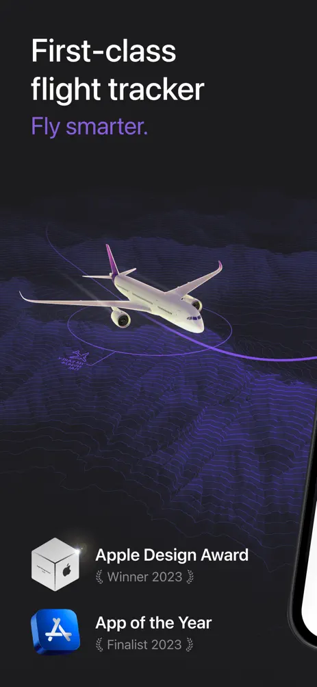
Raycast: a red glow and monospaced labels
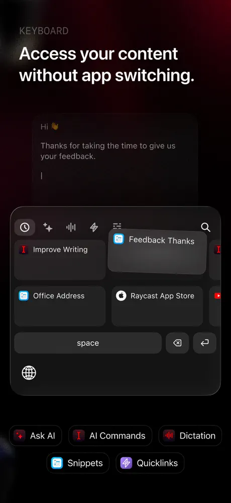
Raycast’s frames are black with a red glow and glossy, floating keycaps and app symbols that carry the brand’s 3D style. Every frame has a small monospaced label above the headline (AI CHAT, RAYCAST NOTES, DICTATION, SNIPPETS & QUICKLINKS, & MORE, KEYBOARD), which reads like the product’s own interface.
The phones fade into the dark instead of sitting in a frame, and their lower halves are cropped away. The effect is closer to a product film than a feature list.
 All 6 frames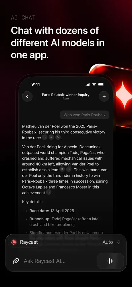

Strava: the brand color as the light
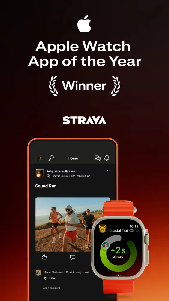
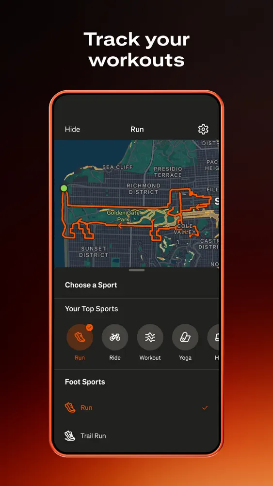
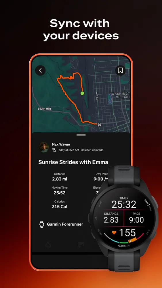
Strava runs every frame from black at the top to a burnt orange glow at the bottom, and the phones have orange outlines. The brand color is not decoration; it is the light in the room.
The first frame leads with the Apple Watch App of the Year laurel and the wordmark, with a watch overlapping the phone. Headlines are short, centerd and in two lines (“Lift it. Log it. See your gains.”), and hardware returns in frame nine with a second watch. Ten frames, one lighting setup.
 All 10 frames