Teardown · No. 01 · 30 Sept 2026
The first frame is a poster
Three listings that hold the phone back for one frame and open with a statement instead.
In search results, the App Store shows the first three screenshots of an app at thumbnail size, next to a dozen competitors. Most listings spend that first slot on a phone full of interface that nobody can read at that size. These three spend it on a poster: a sentence, a mark, a little proof, and no phone.
The interface still arrives, one frame later. The opening is doing a different job: it tells you what the app is for and why to trust it before asking you to look at anything.
Structured: proof first, product second
The first frame is pale pink and almost all type: “your simple day planner”, set in two weights, then a stack of credentials. An App Store Awards finalist laurel sits above the headline; a Forbes quote, Editors’ Choice and App of the Day sit below it.
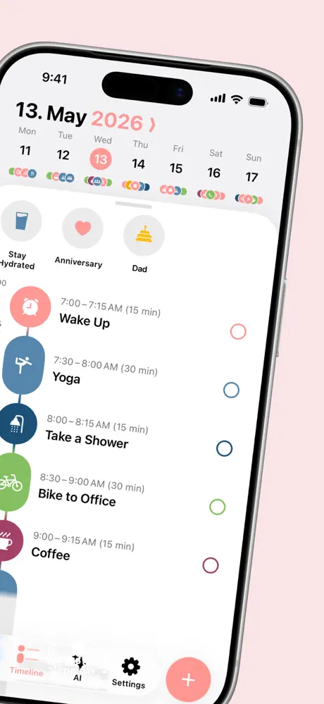
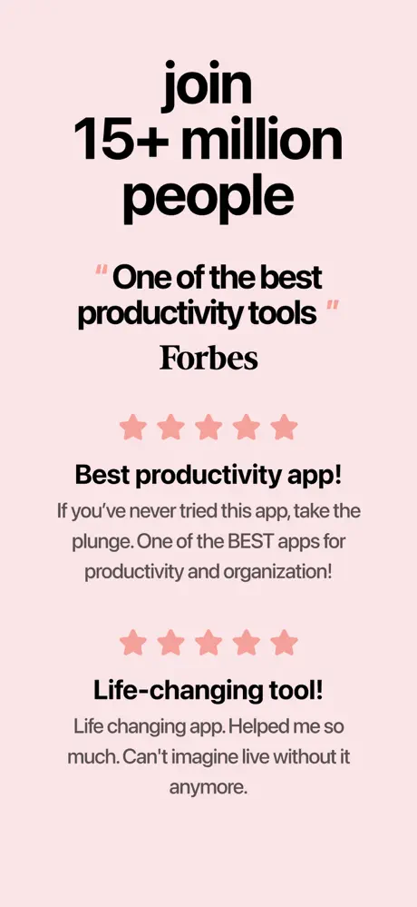
The phone only appears in frame two, and it enters at an angle and runs off the edge, so the two frames read as one wide panel when they sit side by side. The last frame closes the loop with more proof: “join 15+ million people”, the Forbes line again and two reviews. The sequence is bookended by credibility, with the product in between.
 All 8 frames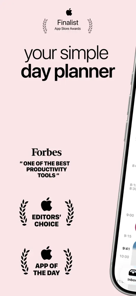
stoic.: a mood before a feature
stoic. opens with its lowercase wordmark, a three-line promise (“Daily Self Care for Better Mental Health.”), two small award laurels and a black illustrated still life of a bird, a light bulb, a feather and a pencil. It looks like the cover of a notebook.
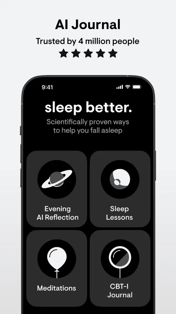
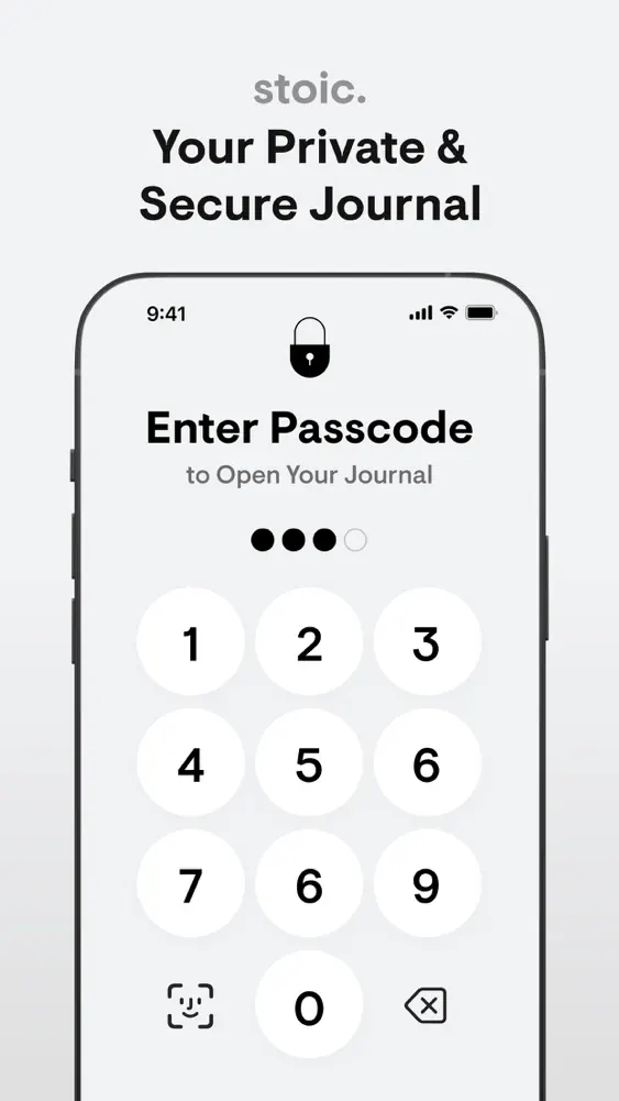
Everything after it stays in grayscale: white phones on a pale gray ground, one black phone in frame three for the sleep features. The illustrations from the cover return as icons inside the interface, so the poster and the product feel like the same object. The final frame is the passcode screen, which makes privacy the last word.
 All 10 frames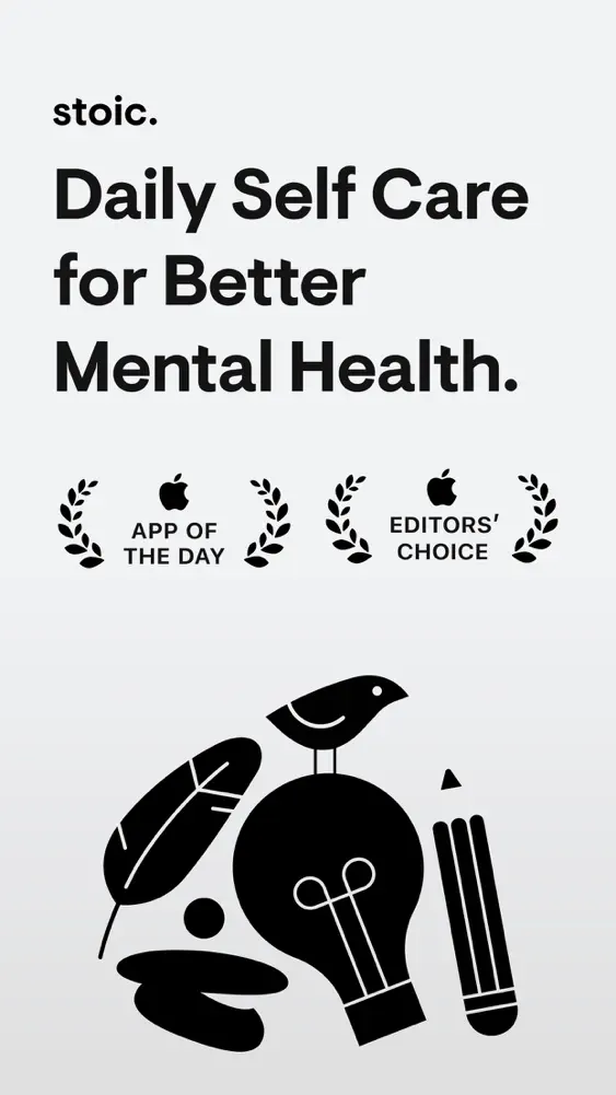
(Not Boring) Weather: save the color for the end
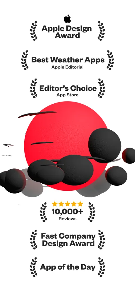
The opening frame stacks five laurels, from the Apple Design Award down to App of the Day, beside a rendered red sun half hidden by black clouds. The brand here is the objects themselves, not a logo.
The middle of the set is gray and black, with the interface shown as dense, graphic data, then two warm beige frames show off customization. The last frame turns saturated yellow for the tagline, “Life’s too short to waste on boring apps.”, over a giant condensed 58. No other frame has a background that loud, so the sign-off is what you remember.
 All 8 frames