kit0

Compare screenshots

Read two sequences in their original order.

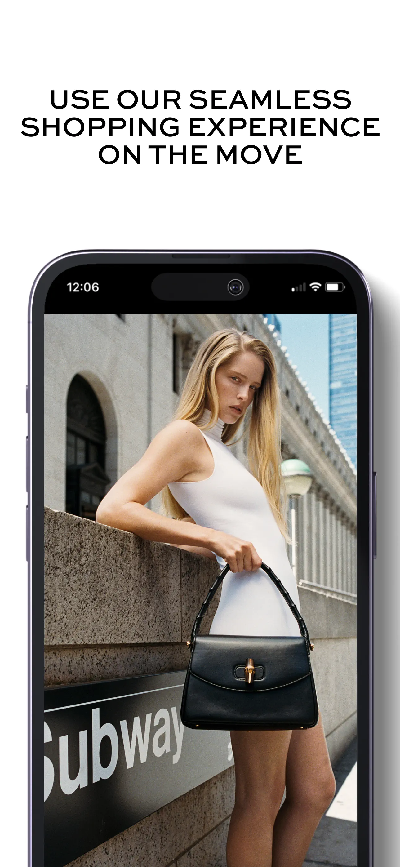
NET-A-PORTER

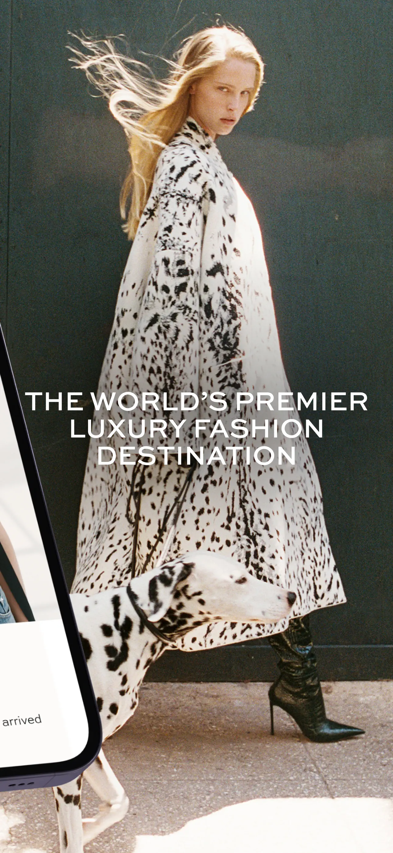
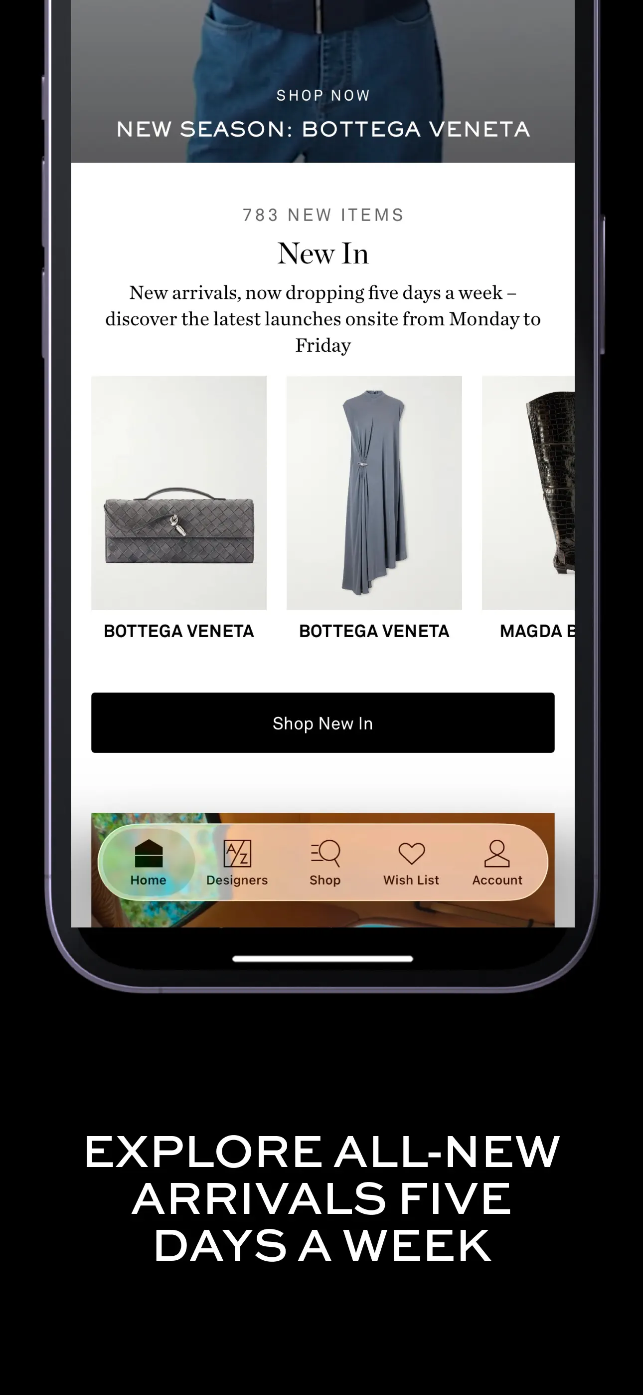
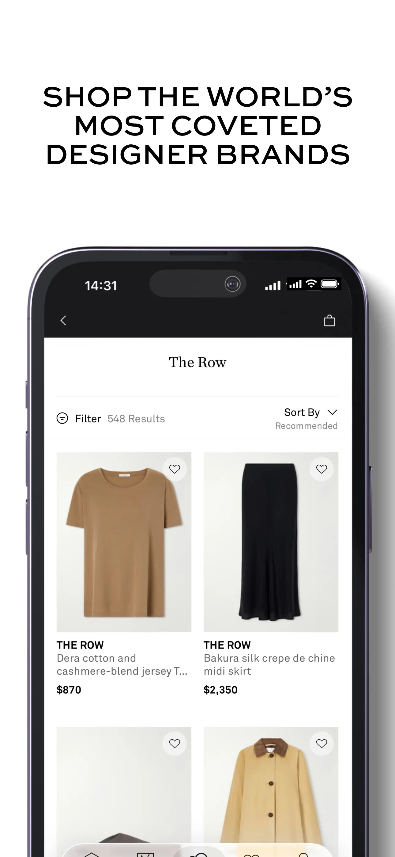
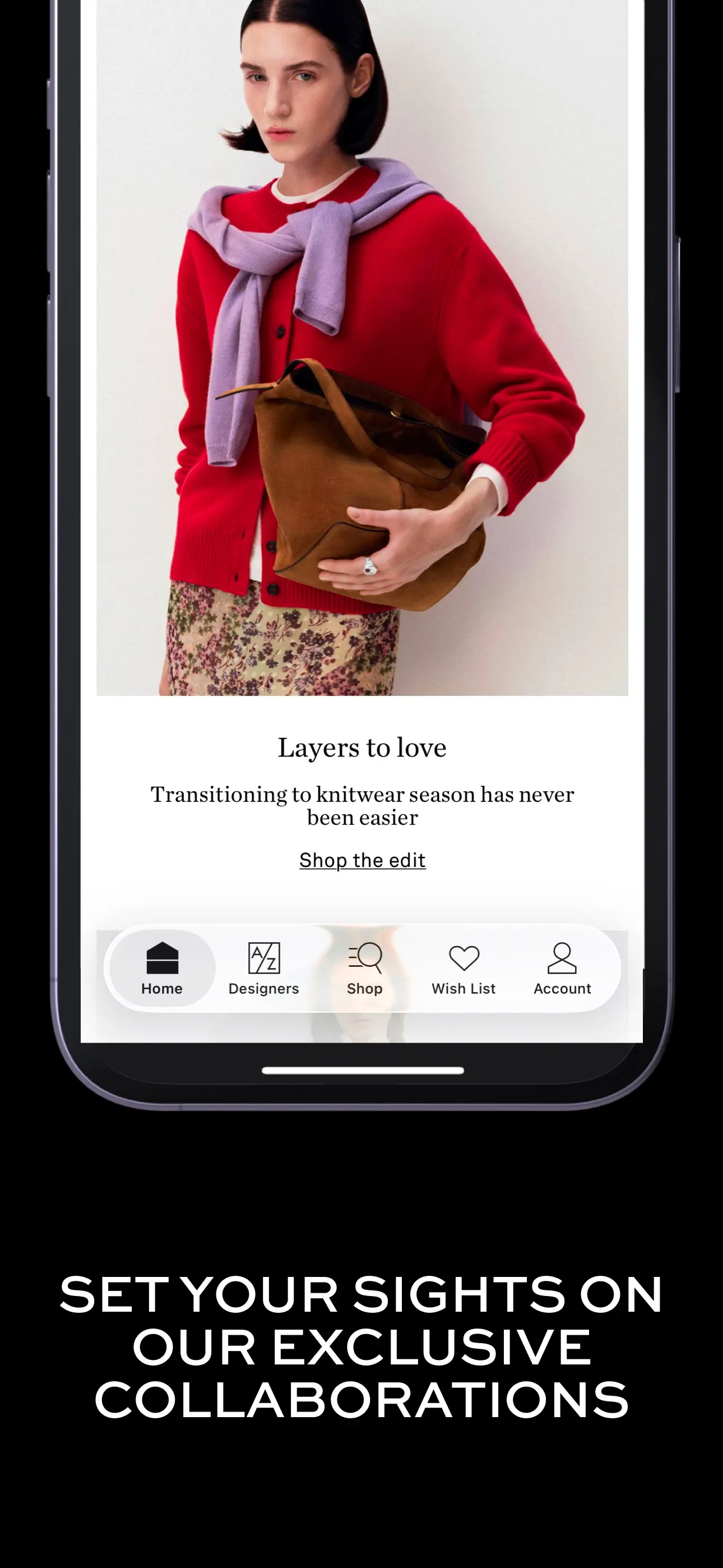
Black and white headline panels alternate with fashion photography, varying phone scale while maintaining a spare editorial palette.

Things 3

A fixed phone layout gives each planning feature the same space.
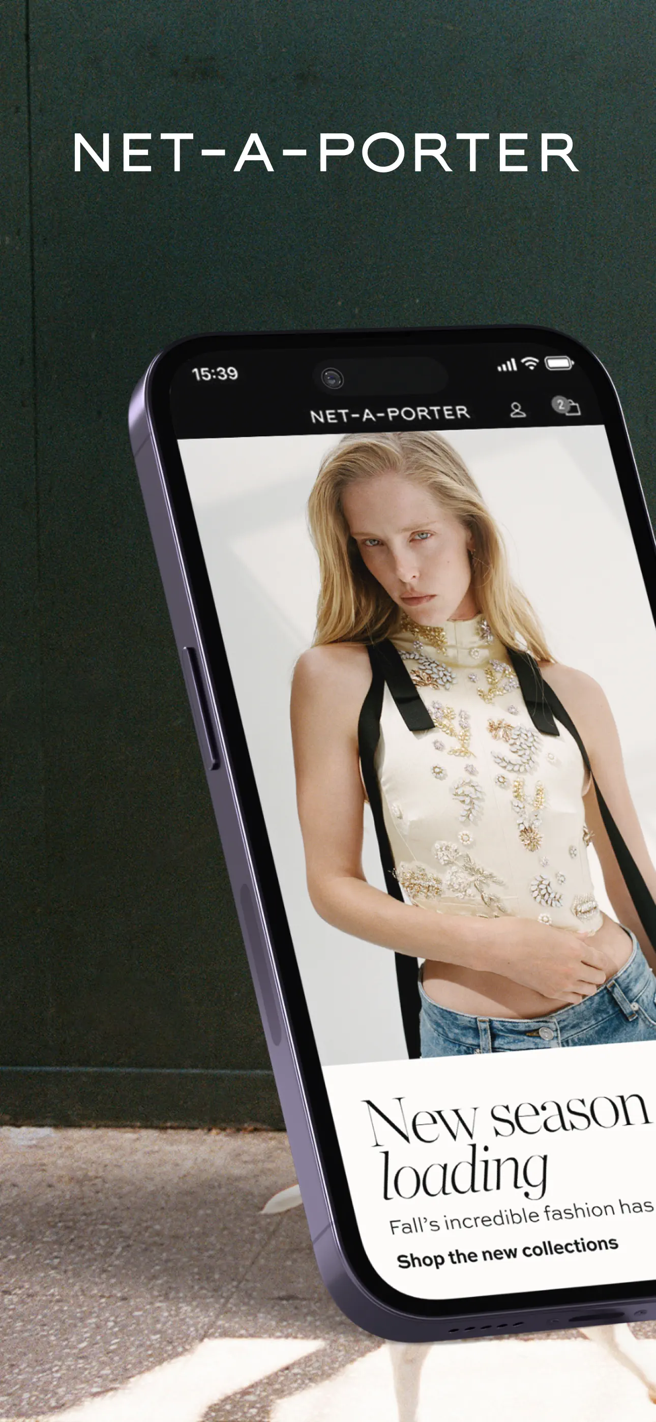
NET-A-PORTER screenshot 1
NET-A-PORTER · 1 / 10
Things 3 screenshot 1
Things 3 · 1 / 8
NET-A-PORTER screenshot 2
NET-A-PORTER · 2 / 10
Things 3 screenshot 2
Things 3 · 2 / 8
NET-A-PORTER screenshot 3
NET-A-PORTER · 3 / 10
Things 3 screenshot 3
Things 3 · 3 / 8
NET-A-PORTER screenshot 4
NET-A-PORTER · 4 / 10
Things 3 screenshot 4
Things 3 · 4 / 8
NET-A-PORTER screenshot 5
NET-A-PORTER · 5 / 10
Things 3 screenshot 5
Things 3 · 5 / 8
NET-A-PORTER screenshot 6
NET-A-PORTER · 6 / 10
Things 3 screenshot 6
Things 3 · 6 / 8
NET-A-PORTER screenshot 7
NET-A-PORTER · 7 / 10
Things 3 screenshot 7
Things 3 · 7 / 8
NET-A-PORTER screenshot 8
NET-A-PORTER · 8 / 10
Things 3 screenshot 8
Things 3 · 8 / 8
NET-A-PORTER screenshot 9
NET-A-PORTER · 9 / 10

End of Things 3 sequence
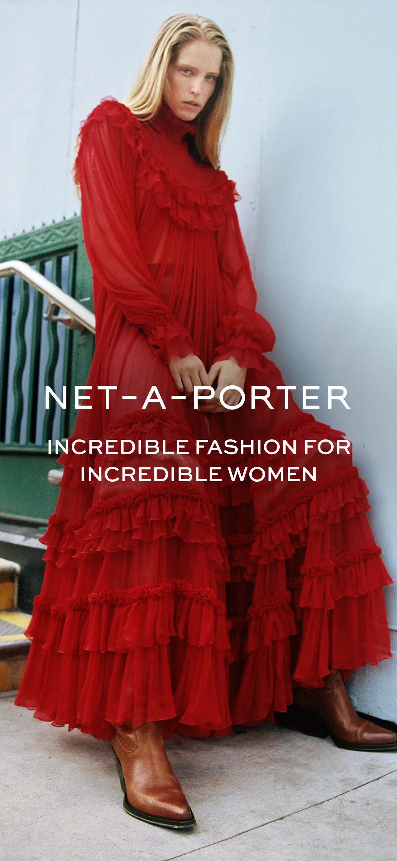
NET-A-PORTER screenshot 10
NET-A-PORTER · 10 / 10

End of Things 3 sequence

Add to collection

New collection